For users & responders
From a reusable analysis template to a published, shareable result — here is the whole journey through the app. Every screen below is an illustrative mockup of the interface.
An analyst defines a reusable Analysis Notebook: a Jupyter notebook that declares the parameters it accepts. Think of it as a form schema attached to code.
Templates are stored as light metadata (slug, title, parameter_schema, source repo, version). See the data model →
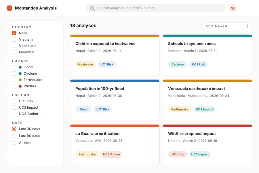
Every generated analysis is indexed and findable. Filter by country, admin area, hazard, disaster or date and click through to the result — served straight from object storage.
Try it
Filter the illustrative catalogue below — the same interaction the real browse page provides.
Illustrative data. In the real app, cards link to the published static-HTML notebook; an empty result could offer to queue a new run for that selection.
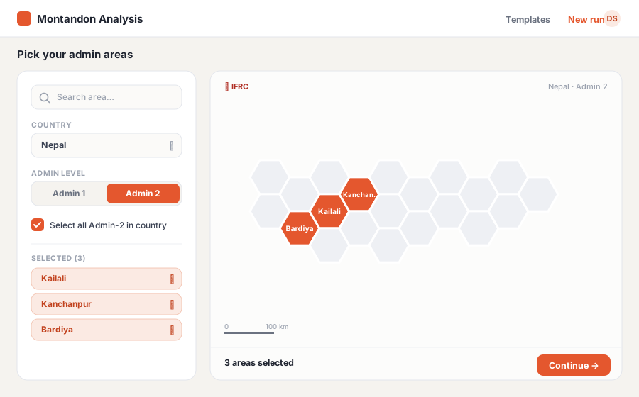
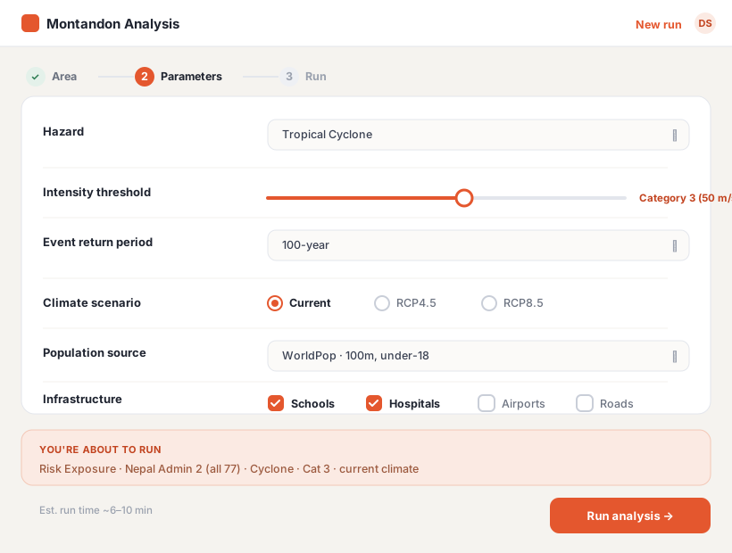
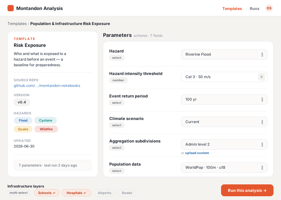
Pick the target admin area on a map — a single district, or “all Admin-2 in a country” — then fill in the analysis parameters. The form is generated from the template’s schema.
Submitting creates a run and hands it to the worker pipeline. You can queue one area or fan out across a whole administrative level in a single request.
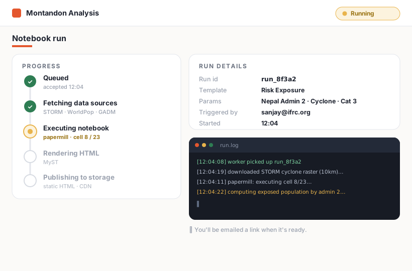
The API creates a NotebookRun (status queued) and enqueues a Celery task. See the sequence →
A worker executes the parameterized notebook with papermill: it pulls the data sources, runs the analysis, and MyST renders the finished notebook to static HTML, which is uploaded to object storage.
Runtimes vary with data volume and resolution. Optimising the notebook execution is a known, tunable problem in the Jupyter ecosystem.
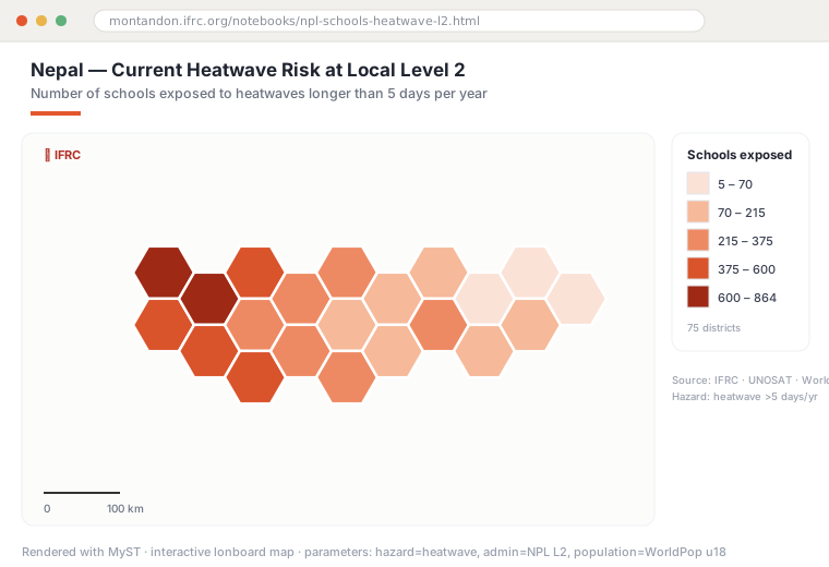
The finished analysis opens as a self-contained web page: interactive maps (lonboard), charts and widgets (manywidgets/anywidget), and result tables — no server or kernel needed.
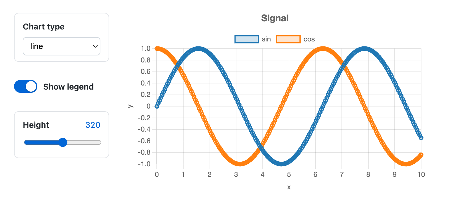
Real, rendered, kernel-free
Captured from the manywidgets project — controls that keep working on a published page with no running kernel. This is the interaction layer inside a generated notebook: a dropdown, a toggle and a slider driving a chart, all client-side.

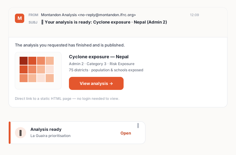
When a run finishes — whether you requested it or it was triggered automatically — you can be notified with a direct link to the result. No login needed to view a published page.
The three use cases — risk exposure, post-disaster impact, and response prioritisation.