This notebook demonstrates how to create interactive charts using our Chart.js-based anywidget, with a matplotlib-compatible API for easy migration from static plots to interactive visualizations.
import sys
import pathlib
sys.path.insert(0, str(pathlib.Path().absolute().parent))

import numpy as np
import pandas as pd
from widgets.chart_widget import ChartWidget, ChartPlot
import matplotlib.pyplot as plt
Example 1: Simple Line Chart - Matplotlib vs Interactive
First, let’s create a simple sine wave using matplotlib:
# Generate data
x = np.linspace(0, 4 * np.pi, 100)
y = np.sin(x)

# Matplotlib version (static)
plt.figure(figsize=(10, 4))
plt.plot(x, y, label='sin(x)', color='blue')
plt.xlabel('X axis')
plt.ylabel('Y axis')
plt.title('Static Plot with Matplotlib')
plt.legend()
plt.grid(True)
plt.show()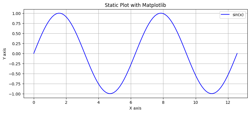
Now the same plot but interactive using our Chart widget with matplotlib-compatible API:
# Interactive version with Chart widget
chart = ChartPlot(figsize=(10, 4))
chart.plot(x, y, label='sin(x)', color='blue')
chart.xlabel('X axis')
chart.ylabel('Y axis')
chart.title('Interactive Plot with Chart Widget')
chart.legend()
chart.show()
Example 2: Multiple Series
# Generate multiple series
x = np.linspace(0, 4 * np.pi, 100)
y1 = np.sin(x)
y2 = np.cos(x)
y3 = np.sin(x) * np.exp(-x/10)

# Matplotlib version
plt.figure(figsize=(10, 4))
plt.plot(x, y1, label='sin(x)')
plt.plot(x, y2, label='cos(x)')
plt.plot(x, y3, label='damped sine')
plt.xlabel('Time')
plt.ylabel('Amplitude')
plt.title('Multiple Series - Matplotlib')
plt.legend()
plt.grid(True)
plt.show()
# Interactive version
chart = ChartPlot(figsize=(10, 4))
chart.plot(x, y1, label='sin(x)')
chart.plot(x, y2, label='cos(x)')
chart.plot(x, y3, label='damped sine')
chart.xlabel('Time')
chart.ylabel('Amplitude')
chart.title('Multiple Series - Interactive (hover to see values)')
chart.legend()
chart.show()
Example 3: Scatter Plot
# Generate random scatter data
np.random.seed(42)
n_points = 200
x_scatter = np.random.randn(n_points)
y_scatter = 2 * x_scatter + np.random.randn(n_points) * 0.5

# Interactive scatter plot
chart = ChartPlot(figsize=(10, 6))
chart.scatter(x_scatter, y_scatter, label='Data points', c='red', s=50)
chart.xlabel('X values')
chart.ylabel('Y values')
chart.title('Interactive Scatter Plot (click on points for details)')
chart.legend()
chart.show()
Example 4: Mixed Chart Types
# Generate data for mixed visualization
x = np.linspace(0, 10, 50)
y_line = np.sin(x)
x_scatter = np.random.uniform(0, 10, 30)
y_scatter = np.sin(x_scatter) + np.random.randn(30) * 0.2

# Create mixed chart
chart = ChartPlot(figsize=(10, 6))
chart.plot(x, y_line, label='Fitted curve', color='blue', linewidth=2)
chart.scatter(x_scatter, y_scatter, label='Observations', c='orange', s=80)
chart.xlabel('Time')
chart.ylabel('Value')
chart.title('Mixed Chart Types - Line + Scatter')
chart.legend()
chart.show()
Example 5: Bar Chart
# Bar chart data
categories = np.arange(5)
values = [23, 45, 56, 78, 32]

chart = ChartPlot(figsize=(10, 5))
chart.bar(categories, values, label='Sales', color='green')
chart.xlabel('Product Category')
chart.ylabel('Sales (thousands)')
chart.title('Interactive Bar Chart')
chart.show()
Example 6: Direct Widget API for More Control
# Using the widget directly for more control
widget = ChartWidget(
    title="Direct Widget API Example",
    x_label="X Axis",
    y_label="Y Axis",
    width=800,
    height=400,
    animation_enabled=True,
    tooltips_enabled=True
)

# Add multiple series with different types
x = np.linspace(0, 10, 50)
widget.add_series(x=x, y=np.sin(x), series_type='line', name='Sine Wave', color='#2196F3')
widget.add_series(x=x, y=np.cos(x), series_type='line', name='Cosine Wave', color='#4CAF50')

widget
Example 7: Event Handling
The widget tracks clicks and hover events:
# Check clicked point
print("Last clicked point:", widget.clicked_point)
print("Last hover point:", widget.hover_point)
Last clicked point: {}
Last hover point: {}
Summary
This notebook demonstrated:
Matplotlib-compatible API - Easy migration from static plots
Interactive features - Hover tooltips, zoom, click events
Multiple chart types - Line, scatter, bar, mixed
Performance - Smooth interaction even with many data points
Direct widget API - For advanced control and customization
The Chart widget provides a seamless way to upgrade from static matplotlib plots to interactive visualizations while keeping the familiar API.