ChartGPU renders charts via WebGPU compute shaders, handling hundreds of thousands of points at 60+ FPS. matplotlib’s static PNG is fine for small data and final figures, but for exploring large datasets you need interactivity — you can’t zoom into a PNG.
This is a first experiment: a 100,000-point scatter plot. Drag to pan, scroll to zoom — every point stays live.
Browser requirements: Chrome 113+, Edge 113+, or Safari 18+ (WebGPU).
import sys
import pathlib
sys.path.insert(0, str(pathlib.Path().absolute().parent))
import numpy as np
import matplotlib.pyplot as plt
from widgets.chartgpu_widget import ChartGPUWidgetFinding clusters in noisy measurements
Imagine you’ve run a flow-cytometry experiment, surveyed an astronomical field, or aggregated 100K sensor readings. The first question is always: are there distinct populations in this data?
A scatter plot is the obvious move, but with this much data every static renderer hits a wall: subsample (and lose density), or plot everything (and end up with an unreadable blob).
np.random.seed(42)
n_clusters = 5
n_points_per_cluster = 20000
total_points = n_clusters * n_points_per_cluster
x_data, y_data = [], []
for i in range(n_clusters):
cx, cy = np.random.uniform(-10, 10, 2)
cluster_x = np.random.normal(cx, np.random.uniform(0.5, 2.0), n_points_per_cluster)
cluster_y = np.random.normal(cy, np.random.uniform(0.5, 2.0), n_points_per_cluster)
x_data.extend(cluster_x); y_data.extend(cluster_y)
x_data = np.array(x_data); y_data = np.array(y_data)
print(f"Generated {total_points:,} data points across {n_clusters} clusters")Generated 100,000 data points across 5 clusters
Matplotlib: forced to downsample
100K points is enough that even drawing them once locks up matplotlib for a noticeable beat, and the resulting PNG is just a smear. The conventional move is to subsample — here, 5,000 of the 100,000 points — which loses most of the density information.
sample_size = 5000
sample_idx = np.random.choice(total_points, sample_size, replace=False)
plt.figure(figsize=(9, 7))
plt.scatter(x_data[sample_idx], y_data[sample_idx], alpha=0.5, s=2)
plt.title(f"matplotlib — showing {sample_size:,} of {total_points:,} points")
plt.xlabel("X"); plt.ylabel("Y"); plt.grid(True, alpha=0.3)
plt.show()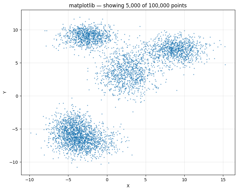
ChartGPU: every point, fully interactive
All 100,000 points, no subsampling. The cluster structure becomes immediately visible — and stays visible as you zoom into any region.
scatter_data = [[float(x_data[i]), float(y_data[i])] for i in range(len(x_data))]
scatter_chart = ChartGPUWidget(
title=f"All {total_points:,} points (GPU accelerated)",
x_label="X", y_label="Y",
width=1000, height=700,
show_fps=True,
chart_type="scatter",
)
scatter_chart.add_series(scatter_data, series_type="scatter", name="Observations", color="#FF5722")
scatter_chartmatplotlib is fine for small data and final figures. For exploring large datasets you need to be able to zoom in — and that’s the gap WebGPU charts fill.